Lance Inimgba

Data science enthusiast who loves getting lost in Jupyter notebooks 😋
Love travel and foodie actvities!
View My LinkedIn Profile
Massachusetts School Project

IMPORTANT NOTE!! You may right click on any of the images and click “Open image in new tab” to enlarge any of the images below
In this project, I will be assuming the role of a new hire on the Massachusetts Department of Education data team. I’ve been asked with doing the following by a fictional superintendent:
- What schools are struggling the most?
- What are the top math schools in the state?
- How does class size affect college admission?
This project is something that hits somewhat close to me since I also worked as an educator overseas. Therefore, I was quite curious about the contents of this dataset and the relationships between the columns that could possibly be discovered.
This time, I’ll be using Tableau to work with our already cleaned dataset and will provide the answer to the questions that I’ve been assigned to uncover. Stay tuned!
Data Analysis
Now we’re going to look at our data and begin our analysis of it by answering the first of the questions that we were assigned:
What schools are struggling the most?
To answer this question we’ll need to look at the “% Graduated” column and organize our rows by the “School Name”. Since we know that only the high schools will have non-null values in this column, we then filter out the null values and sort the values in ascending order. We’ll just include the bottom 10 high schools in our analysis. These schools will be highlighted by the blue rectangle in the image below.
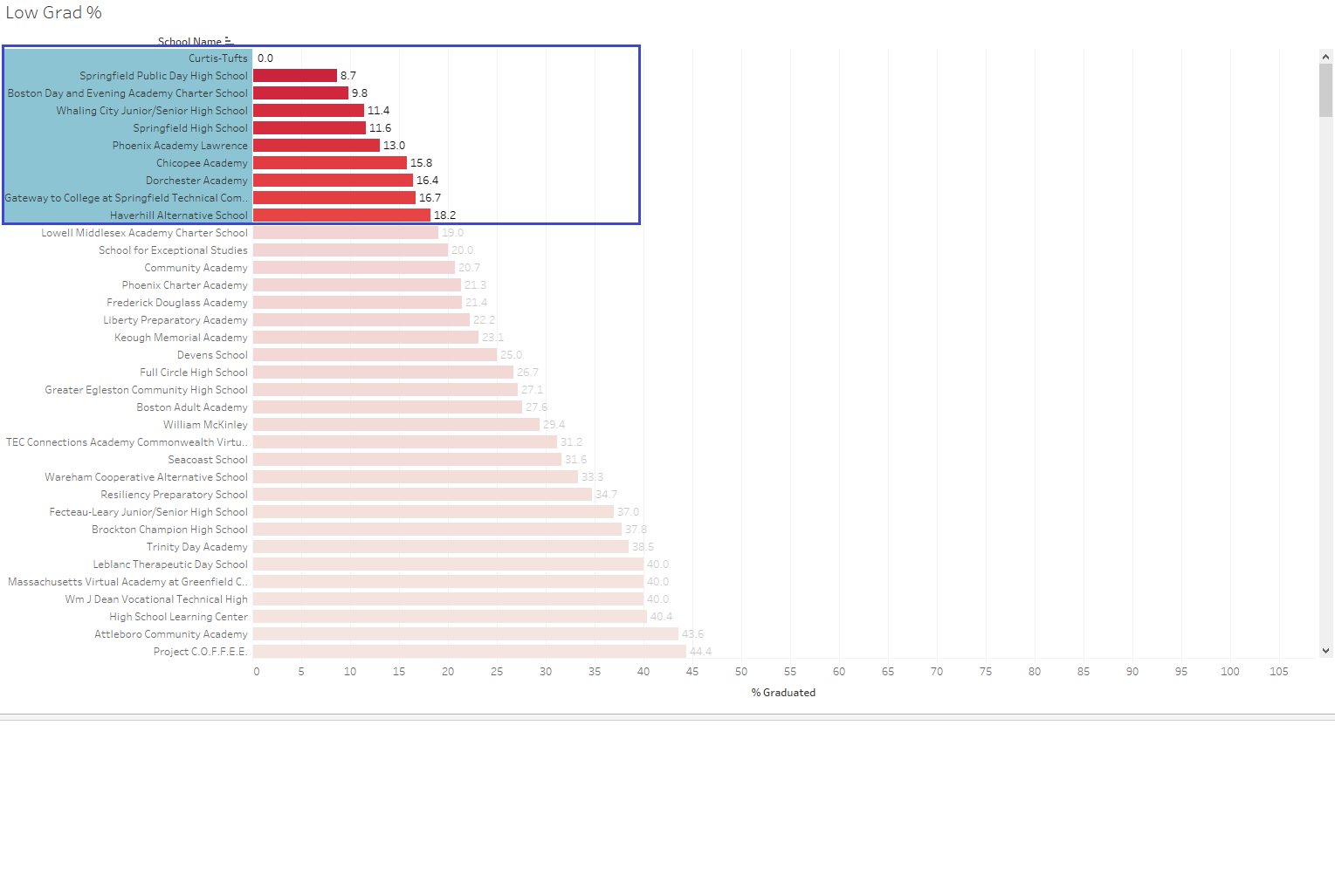 Looking at our selection of schools, since the “% Graduated” column denotes the graduation rate percentage for a given school, we can probably conclude that some of these schools are worth taking a closer look at the values. Upon looking up these schools on Google, the vast majority of these schools are alternative charter schools or low-income schools and in my opinion, shouldn’t be viewed with the same lenses as traditional public high schools. To account for these possible misleading red flags I decided to filter the above output by the “TOTAL Enrollment ‘’ column and set it so that “TOTAL Enrollment ‘’ was equal or greater than 200 students. This was the result as displayed below:
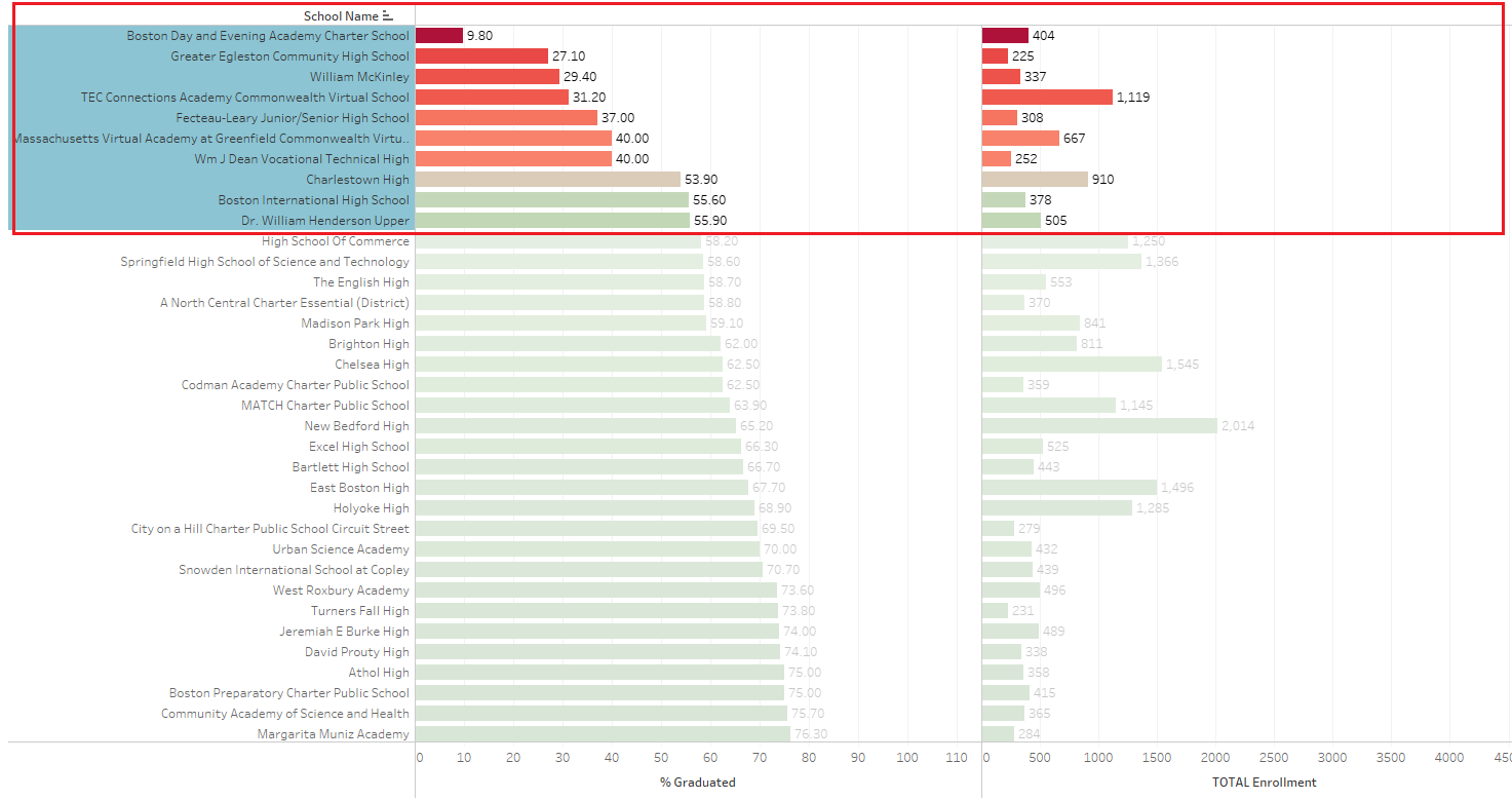
While it’s not perfect, I think it portrays a somewhat more realistic picture than our first plot display. But in a real job setting, I think that it would be wise to communicate closely with the superintendent, the officials in the DoE as well as individual school administration staff, so that we actually ensure that we’re choosing the right schools when determining which schools are “struggling” the most.
What are the top math schools in the state?
To answer this question, I have been tasked by a superintendent to focus on 4th Grade level math scores as they felt that particular grade level is a pretty good indicator on whether students would be able to keep on having success in higher grade levels.
In addition, they also want to know which districts are above the desired threshold of 50 percent and would like to collect the names of these districts, so that these teachers can be invited to lead workshops to train the rest of the teachers across the state. So we will create a bar graph and use the aggregated average of the “% MCAS 4th Math Grade P” and group all of our rows by “District Name” to find out what the highest performing districts are.
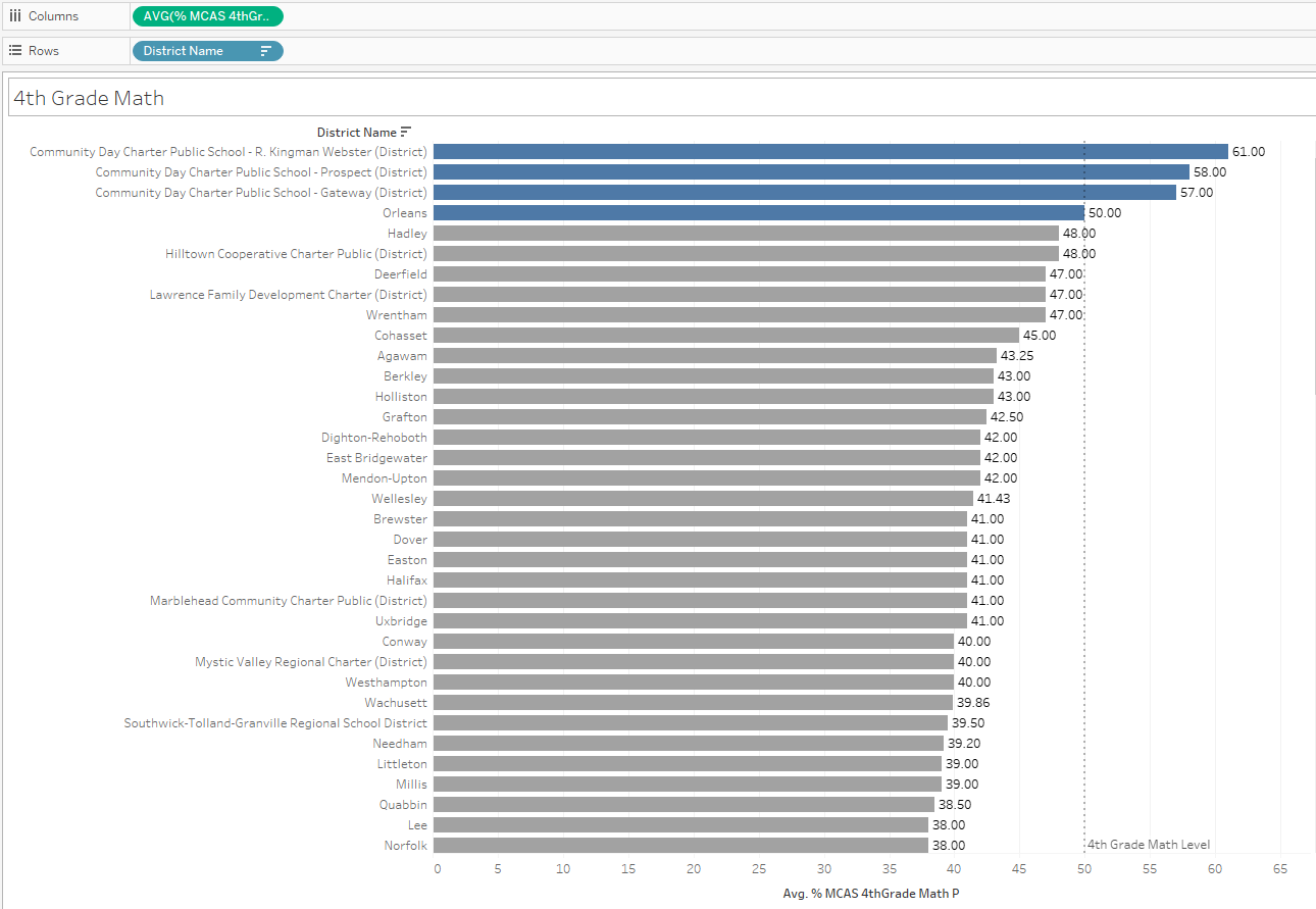
According to our findings, these 4 districts met our above 50 percent threshold:
- Community Day Charter Public School- R. Kingman Webster (District)
- Community Day Charter Public School- Prospect (District)
- Community Day Charter Public School- Gateway (District)
- Orleans
#### How does class size affect college admission?
For our final question, the superintendent has tasked me to see if we can find a relationship between class sizes and college. If we can successfully establish a connection between these two variables, the DoE will consider investing in building more schools with the intent of lowering class sizes and increasing college enrollment. Now let’s take the “% Attending College” and “Average Class Size” columns and make ourselves a nice scatter plot! As a bonus, we’ll also include the average of the “% Economically Disadvantaged” column as another way to distinguish the plot points.
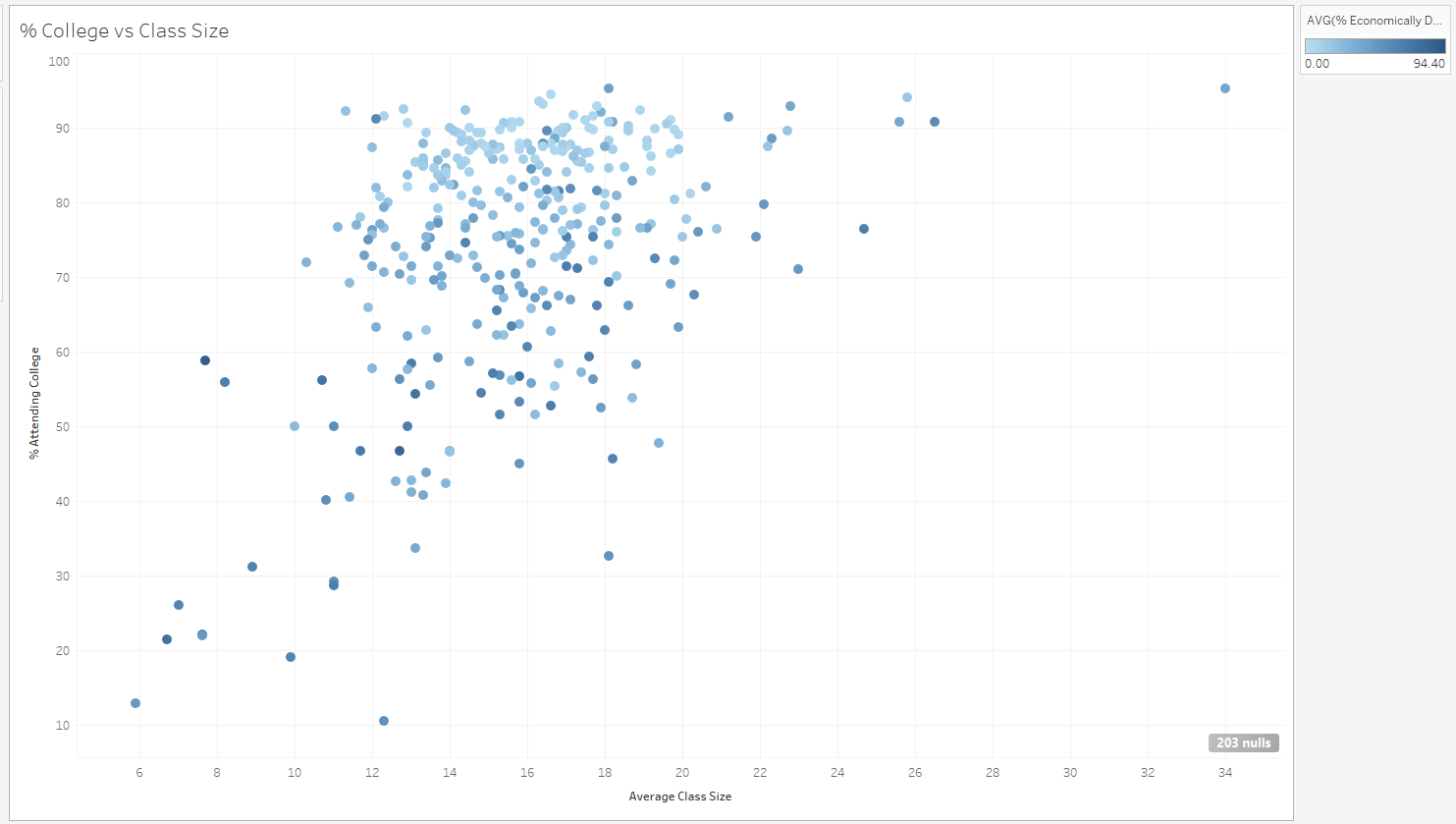
Analyzing this plot, I have to conclude that there isn’t really a relationship between smaller class sizes and college attendance. But seeing all the light circles at the top of the graph shows that schools that have a lower percentage of economically disadvantaged students have a definitively higher chance of going on to college.
So at this point, I would inform the superintendent that we should focus on building better schools or improve existing schools for economically disadvantaged students rather than building more schools.
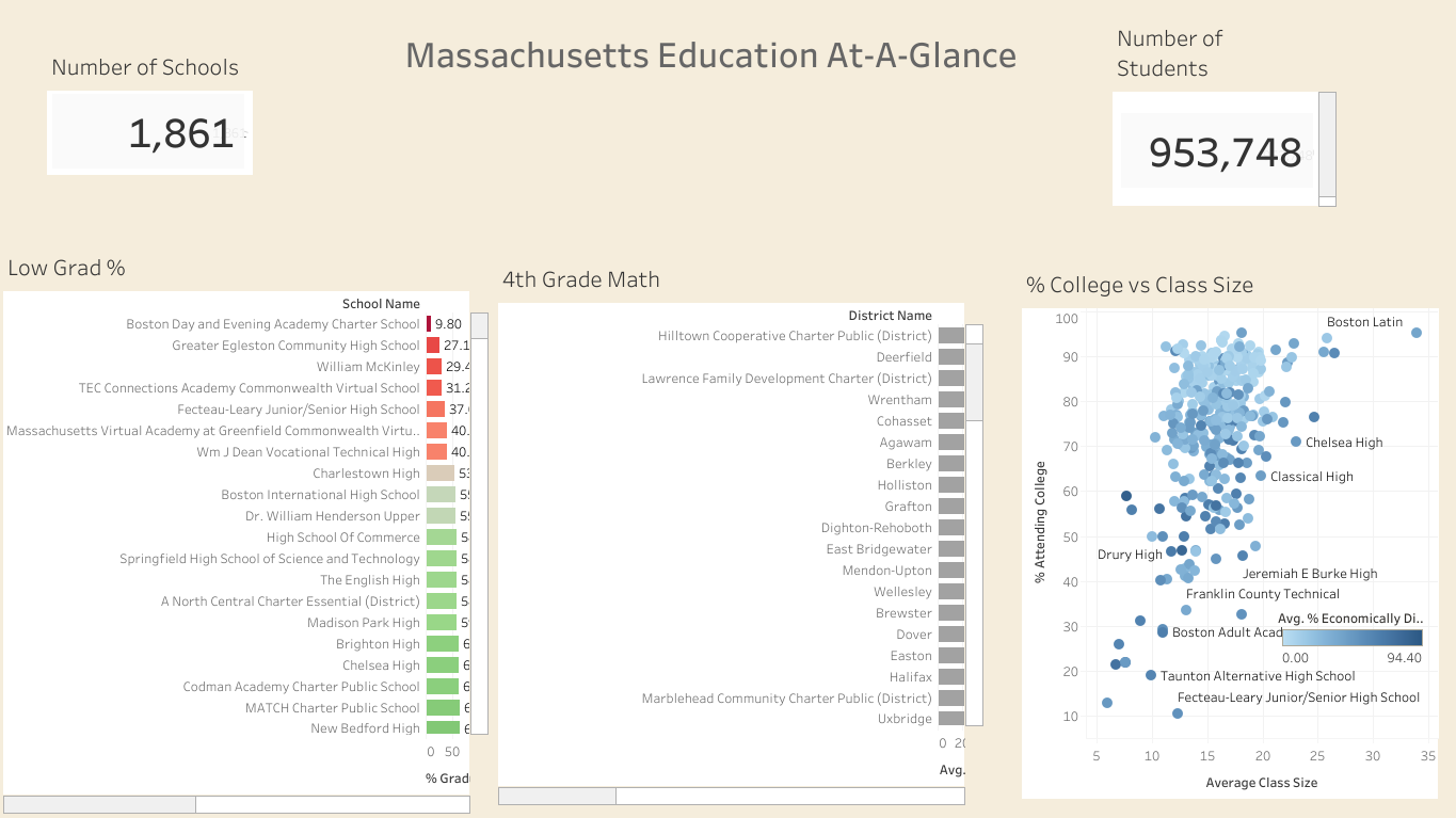
The full dashboard of our data visualizations
Recap/Conclusion
Once again to recap what we were instructed to do:
- What schools are struggling the most?
- What are the top math schools in the state?
- How does class size affect college admission?
I feel that I did answer these questions to the best of my ability in a limited scope of time and we can all come away with a much better understanding of the overall picture for the public school system in Massachusetts. But I feel that this is only the tip of the iceberg in insights that we can uncover from just these 3 questions. Given more time and some deeper data-diving, I’m confident that we can find even clearer insights as well. But with what I was able to do, I have a stronger sense of conviction that there is absolutely a correlation between schools that have a large amount of economically disadvantaged students and academic performance and that is my own main personal takeaway from this report.
Thank you so much for your time and reading all of this! This was an absolute pleasure to do and if you have any questions, please comment below or please contact me at lance.inimgba@gmail.com or on LinkedIn!
I’m actively looking for new opportunities in the data science field, so please don’t hesitate to contact me if you know of anything out there!